Most growing teams do not fail because they lack ambition, effort, or even data. They fail because decisions are made into fragments.
Sales look at one set of numbers. Finance tracks another. Operations work off a spreadsheet that only one person truly understands. Customer issues surface in emails and chats but never quite make it into reports. Each function believes it has clarity, yet leadership still feels uncertain when it is time to invest, hire, or change direction.
This disconnect is not caused by a lack of tools. It is caused by a lack of structure.
For smaller organizations, analytics does not need to be complex to be powerful. What it needs is focus. The ability to see a small set of signals that reveal whether the business is healthy, where pressure is building, and where resources are being quietly wasted.
That is where a tightly scoped operating dashboard becomes transformational. Not a collection of dozens of charts, but a single view built around seven metrics that reflect how the business actually runs.
This article walks through what those metrics are, why they matter, and how small teams can build a working analytics layer without creating a heavy data burden.
Why Most Analytics Efforts Stall in Smaller Organizations
Search for guidance on analytics for smaller companies, and you will find two dominant narratives.
One focuses on tools. Lists of platforms, feature comparisons, pricing breakdowns, and deployment options. Useful information but rarely tied to how decisions are actually made.
The other focuses on aspirations. Becoming data driven. Leveraging insights. Unlocking value. These ideas sound right but stop short of showing what to measure first or how to maintain consistency when teams are already stretched thin.
What is missing is the middle path. A practical framework that accepts the realities of small teams.
Limited time.
Limited data engineering capacity.
Multiple systems that were never designed to work together.
In this environment, success does not come from tracking everything. It comes from tracking the right few things, reliably.
The Idea That Changes Everything: One Dashboard, Seven Signals
An effective analytics foundation for a small organization can be built around seven cross-functional metrics. Together, they answer three essential leadership questions.
Are we growing in a healthy way
Are we delivering what we promise
Are we leaking money, time, or customers without realizing it
These metrics are not industry-specific formulas. They are categories that adapt to different business models while keeping decision-making grounded.
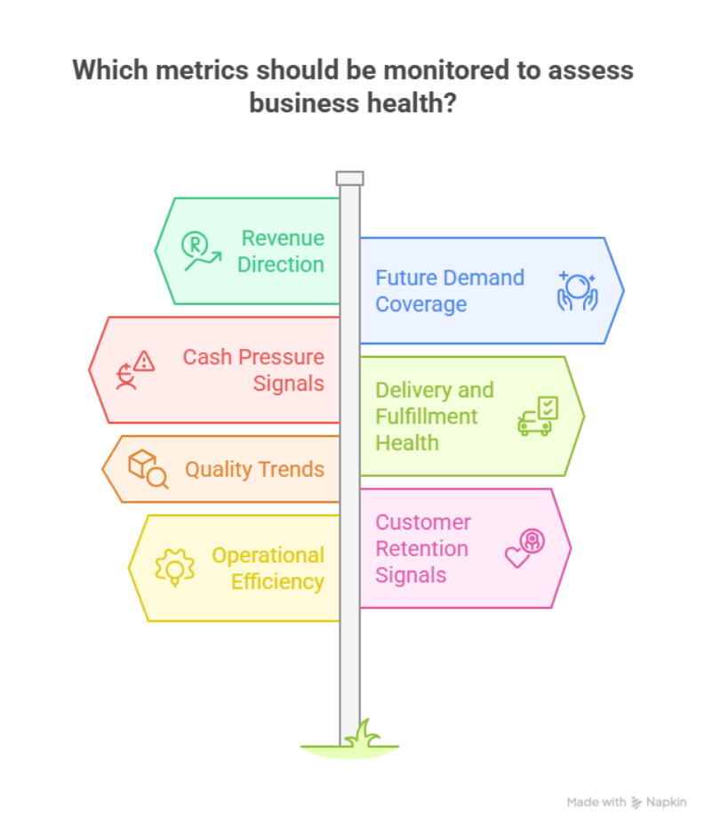
Alt text:
Infographic showing a seven-metric operating dashboard that helps small teams improve visibility, align decisions, and identify risks using connected business data.
1. Revenue trend over time
Not just a monthly total, but a trend that shows direction.
A weekly or rolling view surfaces changes early. It helps leaders see whether growth is accelerating, flattening, or quietly declining before it becomes a crisis.
2. Demand or pipeline coverage
Every business needs visibility into future demand.
For sales-led organizations, this is pipeline coverage against targets.
For e-commerce, it might be ordering volume relative to traffic trends.
For services, it could be booked to work against available capacity.
This metric answers a simple question. Do we have enough future demand to justify our current plans.
3. Cash pressure indicator
Small organizations often underestimate how quickly cash pressure builds.
A combined view of cash on hand, receivables aging, and near-term payables provides early warning. It reduces reliance on gut feel and replaces it with clear signals that support proactive decisions.
4. Delivery or fulfillment health
Every business has a promise it must keep.
That promise may be delivery timelines, project milestones, service response times, or order cycle completion. A single metric that reflects fulfillment of health exposes operational strain long before customers escalate.
5. Quality signal
Growth without quality creates churn and hidden costs.
Quality may show up as return rates, defect trends, rework frequency, SLA breaches, or customer complaints. Tracking one consistent quality indicator keeps teams focused on sustainability, not just volume.
6. Retention or repeat behavior
New acquisition gets attention, but retention sustains momentum.
Depending on the model, this could be churned, repeat purchases, renewals at risk, or inactive accounts. This metric reveals whether value is being delivered after the first transaction.
7. One efficiency metric
Efficiency should be represented but not overcomplicated.
Choose one measure that reflects how effectively resources are being converted into results. Gross margin trend, contribution margin, revenue per employee, or utilization rate are common options.
Why These Seven Work Together
Individually, each metric tells a partial story. Together, they form an operating narrative.
Revenue may be rising, but quality may be slipping.
Demand may look strong, but cash pressure may be increasing.
Delivery may be stable, but retention may be quietly declining.
This balance is what prevents teams from optimizing one area while damaging another.
The Part Most Articles Skip: How to Build this Without Chaos
Analytics projects often fail not because of technology, but because definitions are unclear and data sources conflict.
For small teams, the build process matters as much as the metrics.
Step one: define each metric clearly
Each metric should have a one-sentence definition that everyone agrees with.
What counts as revenue?
What qualifies as an active customer?
What timeframe is used for the delivery of health?
These definitions prevent endless debates later and establish trust in the numbers.
Step two: identify where the data lives
Most small organizations already have the data they need, but it sits across disconnected systems. Sales data lives in the CRM. Financials sit in accounting software. Operations and delivery tracking often rely on spreadsheets. Support interactions exist in ticketing tools. Each system was implemented at a different time, for a different purpose, with little thought given to how insights would be combined later.
As reporting needs grow, teams inevitably run into architectural questions about how data should be organized and accessed for analytics. Understanding when to rely on structured systems versus more flexible data stores becomes important for avoiding rework and performance issues later, which is clearly explained in Data Lakes vs. Data Warehouses – Choosing the Right Architecture.
Step three: standardize what must be consistent
Most dashboards break not because the charts are wrong, but because the underlying data does not mean the same thing across systems.
Two issues cause the most damage.
Inconsistent identifiers create fragmentation. The same customer may appear under different names in sales, finance, and support systems. Dates may be recorded differently. Status fields may carry different meanings depending on the team. When these inconsistencies exist, dashboards surface conflicting numbers and quickly lose credibility.
Manual spreadsheet dependencies introduce risk at scale. Spreadsheets rely on human inputs, manual joins, and version control that breaks as reporting becomes more frequent or complex. Small errors compound over time and are difficult to trace once dashboards depend on them.
Standardizing customer names, unique IDs, date formats, and core status fields creates a stable foundation. It allows systems to connect cleanly, reduces reconciliation work, and makes reliable automation possible without constant oversight.
Step four: design for how leaders actually ask questions
Dashboards fail when they are organized by departments instead of by decision.
Leaders rarely think in terms of sales of dashboards or finance dashboards. They ask questions like: Are we on track? Where are we under pressure? What needs attention right now?
An effective structure starts with a single executive view that shows all seven metrics together, with trends and clear indicators for risk or deviation. From there, two or three focused drilldowns allow leaders to explore root causes without losing context.
This approach mirrors real conversations. It supports fast alignment in meetings and reduces the need for separate reports, explanations, or follow-up analysis.
Step five: automate refresh and review regularly
Analytics that depend on manual updates do not survive day-to-day operations.
When dashboards require someone to export files, refresh formulas, or validate numbers manually, they quickly fall out of date. Once trust erodes, teams stop using them.
Automated data refresh ensures that insights reflect the current reality. Pairing this with a consistent review of cadence, such as a weekly operating review, turns analytics into a routine rather than a one-off effort. Over time, this rhythm embeds data into decision-making and reduces reactive firefighting.
When Analytics Starts Delivering Real Value
The impact is not dramatic at first, but it is measurable.
Meetings shift from debating whose numbers are correct to discussing what actions to take.
Decisions move faster because everyone works from the same source of truth.
Operational and financial risks surface earlier, when they are easier and less expensive to address.
At this point, analytics stop functioning as a reporting layer. It becomes part of how the organization is managed.
Turning Clarity Into a Repeatable Advantage
For small teams, analytics only creates value when it reduces uncertainty, not when it adds another layer of complexity. The goal is not to collect more data, but to create shared visibility around the few signals that actually guide decisions.
A focused operating dashboard built on consistent definitions and connected data sources helps teams move faster, align priorities, and respond to issues before they escalate. It replaces fragmented reporting with a common language that leadership, operations, and finance can all trust.
As organizations mature, many begin evaluating BI tools for small businesses that can centralize data from core systems, automate reporting, and support decision-making without the overhead of a full analytics team. Choosing the right approach at this stage often determines whether analytics remains a one-off initiative or becomes a long-term capability that scales with the business.
When implemented with intent, business intelligence stops being about charts and starts becoming part of how the organization operates day to day.